“Dark mode will not save your product from bad accessibility, just like a new coat of paint will not fix a broken elevator.”
The market signals are clear: accessibility is no longer a checkbox for compliance teams. It sits next to revenue in product reviews, shapes funding conversations, and affects how quickly products get adopted inside large companies. Yet many founders and product leads still point to one UI toggle as proof they “care about accessibility”: dark mode. That single switch has become a proxy for inclusive design, and it keeps burning real money.
Investors look for products that can win long-term contracts with enterprises, governments, and regulated sectors. Those buyers now run accessibility audits as part of vendor selection. When a team confuses “dark mode” with “accessibility,” the pattern shows up fast: missed RFPs, lower conversion on trials, higher churn from users who simply cannot use the product for more than fifteen minutes without fatigue. The trend is not clear in every vertical yet, but wherever procurement teams are mature, poor accessibility shows up as lost annual recurring revenue, longer sales cycles, and higher support costs.
Dark mode can reduce eye strain for some users, improve battery life on some screens, and give marketing teams a new screenshot style. That has value. But it does not help a user who cannot operate a drag-and-drop control with a keyboard. It does not help a customer support agent who relies on a screen reader and hits unlabeled icon buttons all day. It does not help a CFO with color vision deficiency trying to read a red/green profit chart in a board report at 11 p.m. These are the users who decide whether your tool stays in the stack or gets replaced by a competitor that did the unglamorous work.
“More than 1 billion people live with some form of disability; products that ignore them leave double-digit revenue on the table in almost every segment.”
The business story here is simple. Accessibility, when treated as a product feature like any other, compounds. It reduces support calls. It increases conversion from trials. It drives usage in teams that would otherwise stay silent or find a workaround. Dark mode, when treated as proof of accessibility, blocks that compounding effect. Teams check a mental box and stop investing where it matters most: interaction design, information structure, and compatibility with assistive tech.
Dark Mode As Branding, Not Inclusion
Dark mode rose on the back of developer tools, chat apps, and late-night productivity habits. For many technical users, it feels comfortable. So founders who build for technical audiences often ship dark mode early and promote it loudly. Marketing decks show split screens: “Light vs Dark.” Social posts show UI in near-black with neon syntax highlighting. The signal to users is “We care about your eyes.” The unintended signal to executives and buyers is “We think this is accessibility.”
The distinction matters. Dark mode is a cosmetic theme choice. It changes background and text colors, maybe some accent shades, but usually keeps the same layout, hit targets, motion, and semantics. True inclusive design runs deeper. It asks who gets excluded at each step of using the product, why that exclusion happens, and what trade-offs need to shift in the design to bring more users in without breaking power use cases.
“Accessibility is good design that works for more people, in more contexts, with lower friction.”
When dark mode ships before basic accessibility, product teams start to believe their own story. The roadmap line item that reads “Accessibility” gets parked after “Analytics v2” and “New pricing page.” From a distance, the product looks modern and polished. From a screen reader’s point of view, it might as well be a blank sheet.
Investors care, but not because of ethics presentations. They care because accessibility maps directly to addressable market size and sales efficiency. A product that works only for fully sighted, fully able, mouse-using users at a desk cuts out a meaningful chunk of enterprise staff. Field workers on tablets, older executives on low brightness, support teams with burnout-induced eye strain, people working in noisy environments who rely on visual cues instead of sound. Dark mode alone does not reach them.
What True Inclusive Design Looks Like
True inclusive design is boring in the best way. It shows up in tab order, heading structure, form behavior, predictable focus states, and clear content hierarchy. It reduces cognitive load, not just glare. The market rewards that kind of boring. It leads to better onboarding, faster task completion, and fewer mistakes that cost time and money.
Investors look for a repeatable pattern: users can get to value without hand-holding. Accessibility issues slow that path. If a new user cannot sign up because the error message is only shown in red with no text explanation, the marketing funnel leaks. If a manager cannot approve requests from a mobile screen reader, adoption stalls.
Here is what inclusive design prioritizes, beyond themes:
1. Perceivable Information
Content must be available to users who see, hear, or interact in different ways. That includes:
– Text alternatives for icons, images, and charts
– Sufficient color contrast in both light and dark themes
– Clear hierarchy with headings and labels
– Support for users who zoom text or increase system font size
Dark mode can sometimes hurt here. Poor theme implementation often drops contrast below accessible thresholds. Light gray text on pure black might look stylish in a Dribbble shot, but it strains real eyes over long sessions.
2. Operable Interfaces
Interfaces must be usable with different input methods: mouse, keyboard, touch, voice, and assistive tech. That means:
– Every interactive element can be reached by keyboard alone
– Visible focus indicators are consistent across light and dark themes
– Interactive targets are large enough and spaced well
– Motion, auto-play, and flashing content can be controlled or disabled
Dark mode has almost nothing to say here. A fully keyboard-accessible app in a single theme serves more users than a mouse-only app with five theme presets.
3. Understandable Interactions
Users need predictable behavior and clear language:
– Labels that match user intent (“Send invoice,” not “Submit”)
– Error states that explain what went wrong and how to fix it
– Consistent patterns for navigation, dialogs, and notifications
– Avoiding reliance on color alone to convey meaning
When charts and dashboards rely on color without texture, icons, or labels, colorblind users lose context. In both light and dark mode. That hits revenue where analytics and reporting are a core part of the product’s price point.
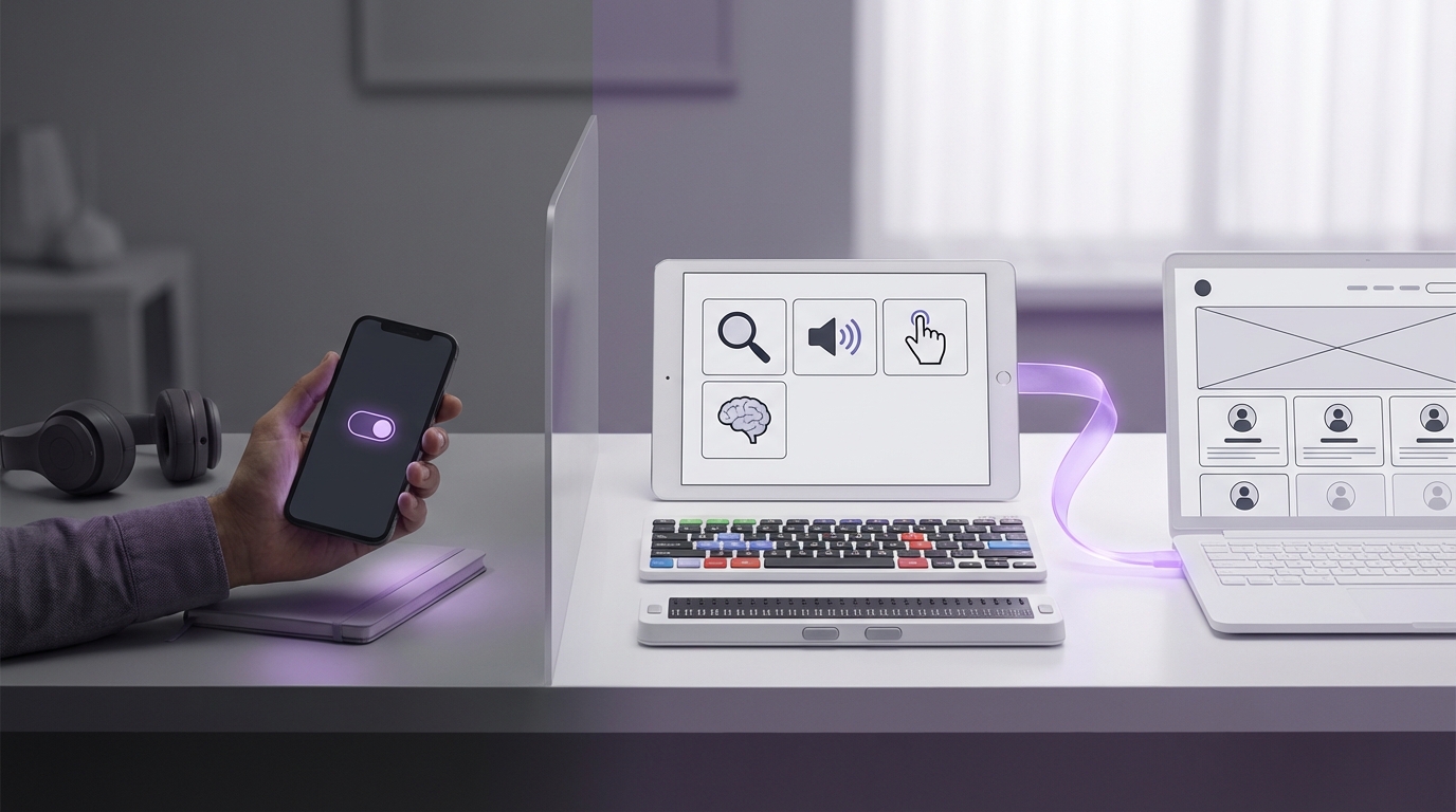
4. Compatible With Assistive Tech
Screen readers, screen magnifiers, voice control, and switch devices sit between the user and the UI. Inclusive design respects that:
– Proper HTML semantics and ARIA where needed
– Logical reading order
– Descriptive button names instead of “Click here”
– Avoiding custom components that do not expose roles or states
Again, dark mode plays almost no role here. An accessible product with one theme wins more deals than an inaccessible one with perfect theming.
Where Dark Mode Fits In The Business Story
Dark mode does have a place. Users who spend ten hours a day in a dashboard often ask for it. For certain segments, dark mode has become part of brand identity. Crypto trading apps, developer tools, code editors, and design tools fall into that group. In these markets, dark mode affects adoption and brand perception. That matters.
The key is to treat dark mode as one piece of visual customization, not as the core of inclusive design. When product teams treat dark mode as a late-stage refinement, after core accessibility is in place, they reduce rework costs. When they do it in the wrong order, they pay twice. They fix contrast issues, then break them in dark mode. They wire semantics for one theme, then copy unlabelled components into the other.
From a cost center view, accessibility looks like a long list of requirements. From a growth view, it looks like a moat. Once a product works smoothly with screen readers, high contrast modes, keyboard-only users, and zoomed interfaces, competitors need significant engineering effort just to match that baseline. That slows copycats.
Accessibility Features That Actually Move Revenue
Many founders ask, “What should we ship first if we want real accessibility without freezing the roadmap?” Investors do not need perfection. They look for evidence that the team understands the basics and can improve over time. That evidence sits in a few specific areas.
“Teams that hit 80 percent of accessibility fundamentals often see higher task completion rates for every user, not just disabled users.”
Here are features that move business metrics more than dark mode does.
Text & Content Controls
Give users control over how they read and process content:
– Adjustable font size within reasonable bounds
– Respect for system-level font size and contrast settings
– Reasonable line height and spacing for long-form text
– Avoidance of large text blocks without headings
Users with mild visual impairments, ADHD, or general fatigue benefit here. That cohort grows with age in every customer base. Better readability increases session length and task completion, which drives usage-based revenue and retention.
Keyboard & Focus Management
Keyboard support looks like a developer chore, but it removes friction in surprising places:
– Power users navigate faster without the mouse
– Support agents with repetitive strain can keep working
– Screen reader users can reach every action
Visible focus states reduce errors. Users no longer click the wrong “Delete” button. That reduces support tickets and data recovery requests.
Color & Contrast Systems Beyond Themes
Instead of bolting dark mode on top of a random color set, build a token-based color system with contrast in mind:
– Define semantic roles: background, surface, primary text, secondary text, accent, error, warning
– Check contrast ratios for both light and dark variants
– Design charts and status badges that work in monochrome or in print
This kind of system supports white-label needs, rebrands, and new vertical products without hurting accessibility. It also improves design handoffs and reduces visual QA time.
Accessible Forms & Workflows
Most business products run on forms: onboarding, checkout, approvals, configuration. Small design choices here have outsized impact:
– Clear labels, not placeholders as labels
– Grouped related inputs with fieldsets
– Inline error messages connected to fields
– Logical tab order that mirrors visual order
Better forms speed up signups and reduce abandonment. For sales teams, that means higher demo completion. For product-led growth, it improves the conversion from free to paid.
Assistive Tech Support & Testing
At some stage, teams need to run through core workflows with a screen reader and other tools:
– NVDA or JAWS on Windows
– VoiceOver on macOS and iOS
– TalkBack on Android
The first round often reveals blocking issues: unlabeled buttons, missing headings, broken dialog focus. Fixing these early in the product’s life is cheaper than refactoring once the interface has grown.
How Dark Mode Can Hurt Accessibility If Done Poorly
Dark mode done wrong does not only fail to help. It can degrade accessibility for everyone.
Common patterns:
Low Contrast Text
Designers often pick pure black backgrounds with mid-gray text because it “feels softer.” On high-resolution screens this can look sharp at first glance, but over time users squint to distinguish characters. Users with cataracts, dry eyes, or fatigue suffer more. The cost shows up as shorter usage sessions and complaints about “hard to read” interfaces.
Color-Only Indicators
Status badges that are green in light mode and a slightly bluer green in dark mode might pass visual QA, but they fail users with color vision differences. Adding icons, patterns, or clear text solves this at little extra cost and works in grayscale printouts.
Inconsistent Focus & Hover States
Hover and focus states that worked in light mode can vanish in dark mode. A light blue outline on a dark background can fall below contrast thresholds. Keyboard users then lose orientation. When the interface “eats” keyboard focus, users abandon tasks.
Hard-Coded Assets
Logos, icons, and illustrations often ship as dark-colored assets that assume a light background. In dark mode they fade or disappear. If those assets carry meaning, users lose cues. Fixing this after release can require asset pipelines, design time, and extra theming logic.
Pricing Accessibility In The Product Roadmap
Product teams often treat accessibility work as a lump sum: “We need three months to fix everything.” That view scares founders and VPs of Product. It also blocks steady progress.
A practical model is to treat accessibility as a recurring line item on the roadmap, tied to user-facing outcomes. Investors favor teams that make small, continuous improvements rather than rare “accessibility sprints” that break other features.
“Accessibility budgets that stay under 10 percent of engineering capacity per quarter can still close most critical gaps if work is planned early.”
Here is one way to structure the investment.
Accessibility Investment Models
| Model | Engineering Allocation | When It Fits | Pros | Risks |
|---|---|---|---|---|
| Reactive | 0-3% of capacity, ad hoc | Very early-stage, few enterprise deals | Low short-term cost | Tech debt, lost RFPs, blocked by compliance later |
| Baseline-first | 15-25% for 1-2 quarters, then 5-10% | Seed to Series B, aiming for mid-market / enterprise | Builds strong foundation, easier to maintain | Needs clear scope to avoid expanding endlessly |
| Integrated | 5-10% every sprint | Teams with stable product-market fit | Steady progress, low rework, strong sales story | Benefits are easy to ignore if not measured |
The “Baseline-first” and “Integrated” patterns both beat “Reactive” in revenue terms, once the product hits real sales cycles. Dark mode can live inside visual polish work, not inside accessibility allocation. That framing avoids confusion and lets executives track accessibility spend against specific business benefits.
Feature Comparison: Dark Mode vs True Accessibility
To make the distinction crisp for boards and leadership, teams can map dark mode to business outcomes side by side with more grounded accessibility features.
| Area | Dark Mode Focus | Accessibility Focus | Primary Business Value |
|---|---|---|---|
| User Comfort | Alternate theme for low-light use | Readable typography, contrast, layout | Longer sessions, reduced fatigue |
| Adoption | Appeal to tech-savvy users | Support keyboard, screen readers, zoom | Larger reachable user base inside each account |
| Compliance | Visual preference | Meets WCAG and internal accessibility policies | Qualifies for more RFPs, fewer legal risks |
| Support Load | Few direct effects | Clear flows, fewer blocked users | Lower ticket volume, shorter handling time |
| Differentiation | Brand perception, nice screenshots | Product can be used by teams competitors ignore | Pricing power, stickier contracts |
This table gives sales and product marketing a clear message: dark mode is a perk; accessibility is a revenue driver.
How Investors Read Accessibility Signals
When investors look at a product that sells into businesses, they map UX quality to sales friction. Accessibility is a strong proxy. The questions they ask are straightforward:
– Can this product survive a procurement audit at a Fortune 500 company?
– Will public sector buyers reject it on accessibility grounds?
– Does the team understand how to build for all employee types, not just tech-savvy ones?
Accessibility answers those questions more convincingly than sleek palettes do.
Signals that investors track:
Documentation & Policy
A public accessibility statement, even if imperfect, shows awareness. A VPAT (Voluntary Product Accessibility Template) gives procurement teams something to work with. The lack of any statement sends a message that the product might break in high-compliance sectors.
Roadmap Ownership
When a head of product can talk through accessibility trade-offs in specific terms, it signals maturity. When the answer to “How do you handle accessibility?” is “We support dark mode and high contrast,” investors read that as a gap.
User Feedback Channels
Support tickets about accessibility issues, and how the team responds, show product quality. Quick, thoughtful responses to users with disabilities build trust and word of mouth. That helps sales more than cosmetic theme options.
Making Dark Mode Part Of Inclusive Customization
Dark mode does not need to stand outside accessibility work. It can sit inside a broader theme system that supports different needs:
– High contrast mode that works in both light and dark variants
– Dyslexia-friendly font option for longer reading tasks
– Reduced motion mode that respects system preferences
– Custom color palettes that preserve contrast ratios
Teams can treat dark mode as one preset in a group of visual profiles. That way, users get dark mode if they want it, and other users get settings that fit their needs better.
Theme System Structure
To keep costs predictable, design tokens can anchor both accessibility and theming:
| Token Category | Example Tokens | Accessibility Impact |
|---|---|---|
| Color | bg-default, text-primary, border-subtle, accent-strong | Consistent contrast in all themes |
| Typography | font-base, font-size-sm/md/lg, line-height-base | Readable text at different sizes |
| Spacing | space-xs/sm/md/lg | Hit target size, readable layout |
| Motion | animation-fast/slow, transitions-enabled flag | Honors reduced motion preferences |
With this structure, dark mode becomes a configuration of tokens rather than a separate stylesheet hacked on top of an inaccessible base.
Common Myths: Dark Mode And Accessibility
Several myths keep circulating in product meetings and design critiques. They slow progress and confuse priorities.
Myth 1: “Users Ask For Dark Mode, So It Must Be Key To Accessibility”
User feedback often comes from the most engaged and vocal users. Developers, designers, and heavy tool users tend to dominate feedback channels. They do ask for dark mode, often loudly. Less vocal users, like those who struggle with complex forms or unreadable error messages, may not send feedback at all. They just stop using the product.
An accessibility roadmap based solely on inbound feature requests will over-index on visible, brandable items like dark mode. Structured research and usability testing with diverse users balances this.
Myth 2: “Dark Mode Reduces Eye Strain For Everyone”
Studies are mixed. Some users find dark mode easier on the eyes. Others read slower or feel more strain with light text on dark backgrounds. For users with certain visual conditions, high contrast dark mode can even trigger discomfort.
Accessibility is about choice and flexibility, not one universal solution. A product that forces dark mode in certain contexts harms users who prefer light backgrounds.
Myth 3: “If We Pass Contrast Checks In Dark Mode, We Are Accessible”
Contrast guidelines are one part of success criteria. They say nothing about keyboard access, focus order, error handling, structure, or assistive tech compatibility. A slideshow of static screens passing a contrast audit does not reflect real user flows.
Practical Steps To Shift From Dark Mode Thinking To Inclusive Design
Teams that have already shipped dark mode can still pivot to true inclusive design without scrapping their work. The shift is cultural and procedural.
1. Reframe Accessibility As Market Access
Present accessibility metrics next to revenue metrics. For example:
– Percentage of enterprise deals that require accessibility documentation
– Tickets per 1,000 users related to usability barriers
– Task success rates for new users with and without assistive tech
This framing makes it easier to justify engineering time than moral appeals alone.
2. Set Baseline Standards
Pick a target such as WCAG 2.1 AA for core workflows and treat it like a minimum performance requirement. Not as a dream state. Then audit your product against that target. Dark mode can stay, but it no longer stands as a proxy.
3. Tie Accessibility To Definition Of Done
When teams add criteria like “Screen reader announces form fields correctly” or “Feature is operable by keyboard” to their Definition of Done, accessibility growth becomes incremental and repeatable. That model avoids giant clean-up projects later.
4. Run Task-Based Accessibility Testing
Instead of static audits, run focused tasks:
– “Create and send an invoice”
– “Add a new team member and assign permissions”
– “Export a report and share it”
Test each task with at least one keyboard-only user and one screen reader user. Record friction points and treat them like any other usability issue.
Why This Matters For Growth, Funding, And Long-Term Value
The link from accessibility to core business outcomes runs through three channels: market size, sales velocity, and retention.
Market Size
Accessibility expands the pool of users who can adopt your product without workarounds. Combined disabilities, aging workforces, and varied work environments mean a rising share of employees rely on accessible tools, even if they never use that word.
Products that ignore this segment shrink their actual addressable market while their pitch decks still show broad numbers. Investors with sector experience see the gap.
Sales Velocity
Prospects that hit accessibility walls during trials slow down or stall. Sales reps spend more time answering questions about workarounds than value. Legal and risk teams join late in the process and add friction.
On the other hand, a clear accessibility story shortens security and compliance reviews. For some sectors, that can shave weeks off the sales cycle.
Retention And Expansion
Even if a champion loves your product, if parts of their team cannot use it, expansion slows. Teams revert to tools that everyone can access. Over time, champions switch as well. This shows up in churn analysis as vague “low adoption” reasons.
Access-friendly products, once embedded, are harder to replace. The switching cost includes retraining users with disabilities, which internal teams prefer to avoid. That increases customer lifetime value.
Dark mode plays at the edge of these dynamics. It can improve perceived polish and help with initial attraction for certain user groups. But it does not protect deals from accessibility audits, does not keep users with disabilities engaged, and does not satisfy regulatory drivers.
Accessibility, treated as inclusive design across interaction, content, and technology, does.